
There's an old saying that tells people not to judge a book by its cover, and almost every reader ignores it anyway. The moment someone scrolls past a bookstore shelf, an online store, or a friend's recommendation, their eyes land on the cover before they read a single word of the story inside. That first judgment happens in seconds, and it shapes whether a reader picks the book up at all. Understanding what actually drives that decision matters far more than most authors and designers realize.
The Book Cover Myth Most Designers Believe
Ask most designers what makes a cover work, and they'll talk about color palettes, illustration style, and visual composition. This isn't wrong, exactly, but it misses something important. Many designers pour hours into the artwork for a book cover while treating the text on that same cover as an afterthought, something to slot in once the visual is finished.
That approach is backwards. The title, the author's name, and any accompanying text are often the very first thing a reader's eye actually processes, especially at the small thumbnail size most books are seen at online. A gorgeous illustration means very little if the title is unreadable or the font feels mismatched with the tone of the story. Readers rarely stop to admire brushwork before they've decided the book is worth their attention. They register text first, whether they realize it or not.
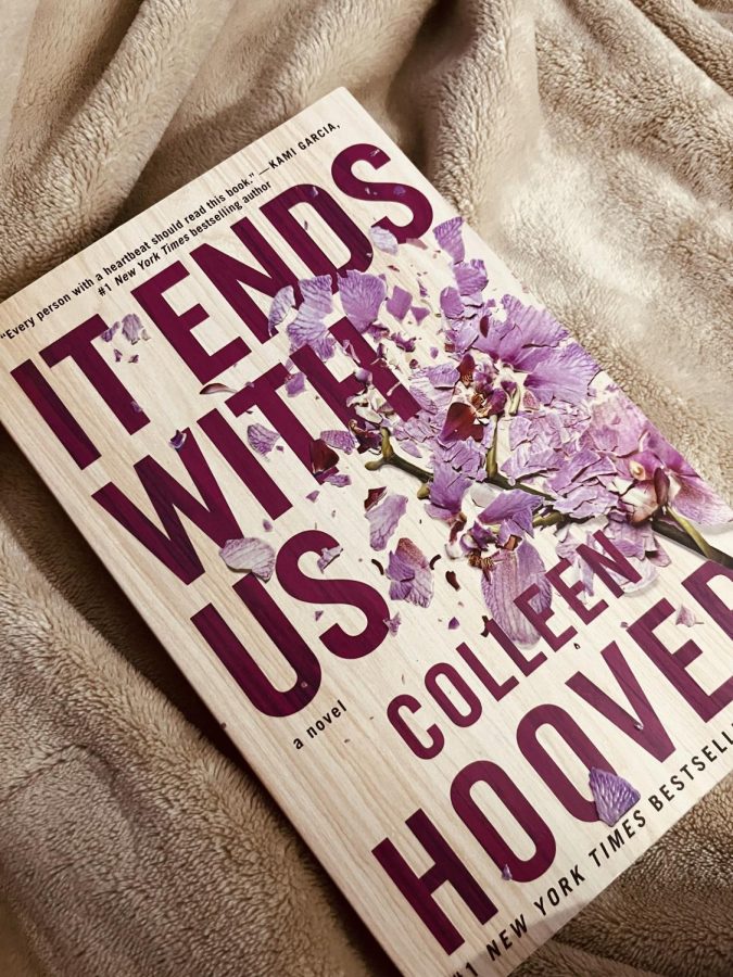
Two Covers, Two Very Different Results
A useful way to see this play out is by comparing two real approaches to cover design. Colleen Hoover's novel "It Ends With Us" became one of the most talked-about books in recent years, and its cover is strikingly simple. It features clean typography, a single flower illustration, and plenty of open space. There's no dense visual scene, no crowded imagery, nothing competing for attention. The text carries the design, and readers responded to it in massive numbers, turning the book into a viral sensation and a fixture on bestseller lists.
Compare that to countless other books released around the same time with far more elaborate, visually packed covers: detailed illustrations, layered scenes, multiple characters, and busy backgrounds. Many of those books, despite their visual ambition, never reached anywhere near the same audience. The lesson isn't that simple covers always outperform complex ones. It's that when text design gets pushed aside in favor of visual complexity, the cover often loses the one element readers actually rely on to make a split-second decision.
Typography sets the tone before any image does
Legibility at thumbnail size matters more than illustration detail
A cluttered cover competes with itself instead of communicating clearly
Strong text hierarchy guides the reader's eye toward the title first
Why Text Design Gets Overlooked
Designers are trained to think visually, so it makes sense that visual elements get the most attention during the design process. But a book cover isn't just an illustration with words attached; it's closer to a piece of branding, where every word carries weight. The font choice, the spacing, the size of the author's name relative to the title, these small text decisions often determine whether a cover feels professional or amateurish.
This gap explains why some traditionally published books, backed by real budgets and experienced teams, still end up with covers that underperform. The visual concept might be beautiful, but if nobody prioritized how the text reads at a glance, the cover fails at its actual job. A cover for the book isn't there to win art awards. It exists to get someone to stop scrolling and pick the story up.
What This Means for Authors
Authors preparing to publish, whether self-publishing or working with a traditional house, should treat cover text with the same seriousness as the visual concept. A few practical habits can make a significant difference.
Test the cover at a small thumbnail size before finalizing it, since that's how most readers will first see it
Choose fonts that match the tone of the story, not just fonts that look striking in isolation
Keep the title legible even against a busy or colorful background
Ask people unfamiliar with the story what they expect the book to be about, based on the cover alone
None of this means visuals don't matter. They absolutely do. But treating text design as secondary is one of the most common and costly mistakes authors make when trying to make a book stand out. Readers form their first impression from text and image together, and ignoring one half of that equation puts even the greatest novels ever written at a disadvantage before anyone opens the first page.
A cover doesn't need to be loud to be effective. It needs to be clear. And clarity, more often than not, starts with the words.